The Inspirations Collection.
Explore.
Catalog.
Scroll to view more.
Welcome to designbivouac’s inspiration collection.
Exploring design and innovation.
Over 30 years of collaboration, designbivouac has uncovered lasting insights. Inspirations is a curated collection of inspirational objects and ideas shaping a continuous journey of creative exploration.
Search Inspiration Entries
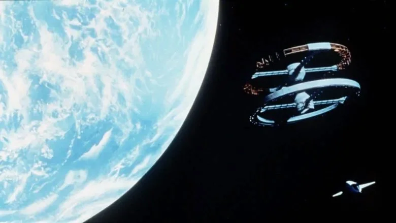
SOLSTICE - 5 | Masterfully Visualizing Scale
Solstice—5: Forgotten Archives offers remarkable visuals that capture the scale of interplanetary exploration. It also delivers a powerful cautionary tale about our exploitation of nature and potential future uses of AI right here on Earth.
The art direction and design by Paul Chadeisson are remarkable. The narrative weaves together suspense, discovery, and the ethical dilemmas of tampering with newly discovered planets. With its blend of mystery, technology, and human curiosity, SOLSTICE—5: Forgotten Archives offers a compelling journey into the unknown, inevitably forcing us to think about how we continue to explore and exist on our own planet.
The visualization masterfully captures a sense of scale. The world it presents is one of immense, forgotten technology — massive spacecraft and towering mechanical platforms that stretch far beyond the horizon. These colossal structures are not just remnants of some distant technological age but monuments to lost ambition, crumbling slowly in the face of time and erosion. What gives them true gravity, however, is their juxtaposition against vast natural landscapes — windswept deserts, jagged cliffs, and still valleys that seem to whisper stories of long-past industrial glory.
The visual storytelling is precise and intentional. Human figures are shown only sparingly, but when they appear, they are small — almost invisible at first glance. A lone explorer, a maintenance worker, or a robed traveler might be standing on a catwalk or dwarfed by the base of a landing gear the size of a city block. These moments are quiet but powerful. The contrast between human and machine scales invites reflection: not only on the limits of human capability but also on the haunting beauty of what we leave behind.
Rediscovering "Thief"
In 1981, well before making another critically acclaimed film featuring thieves, Michael Mann created Thief, starring James Caan. The film’s cinematography, storyline, location selection, and soundtrack from Tangerine Dream set the tone for many action dramas that followed in the 1980s, including the series Miami Vice.
Like Heat would do 14 years later by capturing the frenetic lives of thieves and the police who stalk them in Los Angeles, Thief challenges you to think more deeply about who sits on each side of the law and why. Whether in Chicago, Los Angeles, or Miami, Michael Mann has a gift for portraying a visually compelling underworld balanced by tragedy and shocking violence.
If you have seen the film Thief, let the link above and the film’s unique soundtrack take you back through the life of Frank, a talented jewel thief who emerges after serving twelve years in prison for stealing forty dollars, with a vision for how life will be. Frank's new life includes lifelong loyalty to mentors, the passionate love of a good woman, and a desire to live everyday life to its fullest.
These are admirable aspirations, but the methods Frank employs to attain his goals reveal an undertone of impending consequences that is ever-present throughout the film. Tangerine Dream’s soundtrack perfectly reinforces this throughout the film, accenting action sequences and seamlessly threading the drama together.
The film's authenticity partly stems from the fact that Mann cast some of the best safecrackers for roles in the movie. James Caan was trained to break into safes before filming started so that he would be familiar with the tools and methods used.
The detailed acting of the masterful cast adds deep credibility to Mann’s storytelling style, which is often said to involve the art of capturing truthfulness on film due to the preparedness he requires of his cast members.
If you enjoyed Heat and other works by Michael Mann but have yet to see Thief, give this film a viewing. Compelling visuals, great performances, and a fantastic soundtrack will likely make it worth any time stolen away.
Note: As an Amazon Associate designbivouac may benefit/earn from qualifying purchases.
Here's to 2023 and Beyond...
As we begin stretching to return to our moon, land on Mars, and venture beyond, let us never stop believing in the promise of the future as embodied so poetically by Stanley Kubrick and Johann Strauss II in their times and together in ours.
As we plan a return to the moon, strive to land on Mars, and venture beyond, let us never stop believing in the promise of the future as embodied so poetically by Stanley Kubrick and Johann Strauss II. Both were visionary creatives in their time, and it will take many more like them to overcome today’s challenges and keep moving forward.
The Unreal Work of William Faucher
This process video by William Faucher does an excellent job of capturing the process of photogrammetry and applying remarkable digital visualization skills to capture a scene inspired by Norwegian fishing villages.
This process video by William Faucher does an excellent job of capturing the process of photogrammetry and applying remarkable digital visualization skills to capture a scene inspired by Norwegian fishing villages. This current generation of visualization tools is powerful, but, in the end, the artist must, as always, master the medium that makes the work remarkable.
Photogrammetry is a sophisticated technique that involves the process of extracting precise three-dimensional information about objects, structures, or landscapes from two-dimensional photographs or images. It is widely used in various fields, including surveying, cartography, archeology, and remote sensing. Photogrammetry relies on the principles of geometry and trigonometry to determine the spatial relationships and measurements of objects within the images. Modern photogrammetry often combines traditional methods with advanced software and technology, including aerial and satellite imagery, to create highly detailed and accurate 3D models or maps. This technology has numerous applications, such as creating topographic maps, reconstructing accident scenes, and even producing 3D models of cultural heritage sites, making it an invaluable tool in a variety of industries.
AI-enhanced post
Through the Myst: Creativity and Constraints
The bivouac recently came across this War Stories video by Ars Technica in which Rand Miller recounts how challenging it was to publish the seminal interactive title Myst.
The bivouac recently came across this War Stories video by Ars Technica in which Rand Miller recounts how challenging it was to publish the seminal interactive title Myst. Launching such a beautifully immersive interactive experience was a remarkable feat in 1993. It required creatively navigating the technological constraints of early personal computers, reminding me of embracing the constraints of technology in my interactive work around that time.
Hyped Up On Hypercard
The bivouac had its own “war story” around the same time. The year was 1990. Apple’s HyperCard exposed many future interaction designers to the possibilities of interactive media. Simply placing invisible buttons anywhere over an image opened up creative avenues previously unavailable to storytellers and designers. Approachable and powerful, Bill Atkinson’s creation proved to be a friendly gateway to exploring code and non-linear interaction design for a wide range of designers in the late 1980s and early 1990s.
When clicked, these simple “go to” or “play” scripts were executed, taking users to other cards, flipping through a series of cards to create animations, or playing audio clips. Even though the experience was limited to simple black and white dithered images, Hypercard was its time's compelling and immersive platform with its unique combination of simplicity and creative publishing power. Indeed, hypercards preceded the commercial adoption of the World Wide Web and established the precedent of clicking on “hyperlinks” to navigate to additional information pages, which is commonplace using today’s web browsers.
Hypercard was a simple yet powerful introduction to interactive media for millions of users and designers.
A New Age of Interactive Multimedia
In the early 1990s, at the dawn of the age of interactive media, titles like “Columbus: Encounter, Discover, and Beyond,” produced by Robert Abel and distributed by IBM, set a new bar for empowering students to study a wide range of content in new ways. The title leveraged IBM’s large format IBM Ultimedia optical disc technology and was targeted at educational institutions.
The product description is impressive and reads:
“With James Earl Jones as narrator and Joe Morton as storyteller, these interactive titles span Europe and the Americas from the early Renaissance to the 20th Century from five different cultural perspectives -- White/European, Black/African, Hispanic/Latino, Asian and Native American. The largest multimedia project ever made, "Columbus," is on permanent display at the Library of Congress, National Demonstration Laboratories for new media and technology. Using an IBM CDROM drive, a Pioneer LaserDisc Player, and an advanced concept engine, "Columbus" connects 4400 scenes, 3,500 concepts, 5 hours of video, 180 hours of self-navigable imagery, and over 900,000 soft links on three videodiscs, and one computer optical disc.” This is a testament to the significance of the project.
As a budding interaction designer still in graduate school, I was so excited to see how the team was able to leverage visuals in icon form to help users navigate through the extensive content of the project. The possibilities of placing audio, visuals, and even early QuickTime film loops together, all to enhance storytelling, were influential to see in a commercial setting.
This and a piece focused on the immigration experience at Ellis Island created by Nancy Hechinger, who at the time had her multimedia production studio, Hands On Media. The Ellis Island work influenced my decision to explore using photorealistic points of contact within my interactive thesis work.
Exploring photorealistic points of contact was key to transcending interactive environments, which relied upon metaphor and abstracted icons. Abel’s work bridged the two worlds by providing vivid photos of objects or symbolic images, even on tiny button areas, guiding users across the environment’s functional elements. Hechniger’s work, and it is hoped that my thesis work also pushed the use of interactive elements further, allowing users to be further immersed in a story’s context.
Robert Abel and his team demonstrated the power of multimedia environments in educational contexts.
The Longest Day: An Interactive Thesis
In 1992, as part of creating my thesis work, I explored the use of photorealistic interfaces to immerse users in content. Meredith Davis guided my thesis work at the College of Design at North Carolina State University. Meredith recognized the power of interactive technology early on, and she had deep expertise regarding pedagogy. My thesis project focused on how interactive educational environments could benefit abstract, concrete, active, and reflective learners.
Content focused on the Normandy invasion. Users could explore content using a photorealistic montage of objects common to the battlefields of World War II as an interface. Different days could be selected by clicking on arrows next to the date on the header of the Stars and Stripes newspaper. Content could be explored hourly by clicking on watch hands in the interface. Active learners developed empathy with leaders of the invasion by analyzing cause-and-effect scenarios using a role-playing map. Audio content from the film The Longest Day helped users understand what it must have been like to participate in the invasion. Finally, users could reflect upon their learnings and compose letters home that included audio and video clips from the film. In this way, creative writing skills could be assessed.
Just as with Rand Miller, though on a smaller scale, this thesis work involved overcoming serious technological constraints of the time. Created using Macintosh IIsi with 5MB of RAM and a 40MB hard drive, the Normandy invasion was chosen as a topic in part because the content lent itself well to a greyscale interface aesthetic. Most personal computers at the time were limited to displaying 256 colors, resulting in dithered images. However, computers could accommodate greyscale images acceptably. Similarly, the greyscale QuickTime film clips took less disk space and loaded faster. For further information on this thesis work and the golden dawn of the interactive media era, take a look at this Medium article I wrote a while back.
Upon completing graduate school, I took on a teaching position and, within a year, had shaped and was teaching some of the earliest interaction design courses of the early 1990’s. Working with various undergraduate and graduate students in programs ranging from communications design to painting and sculpture, new interactive media experiences were created with passion. Then, in 1993, Robyn and Rand Miller created Myst, raising the bar for what could be done with the interactive media. It inspired a new generation of interdisciplinary students and creatives to combine the power of computer programming, visualization, audio scapes, music, and storytelling in compelling new ways. Thanks to Rand Miller for sharing his war story and creating an inspirational example of how constraints invite creativity. And thanks for reminding the bivouac of its early 1990s “war story.”


The Longest Day: An Interactive Overview used intuitive photorealistic interaction points throughout the interface.
A Technological Footnote:
Created using Macintosh IIsi with 5MB of RAM and a 40MB hard drive, the Normandy invasion was chosen as a topic in part because the content lent itself well to a greyscale interface aesthetic. Most personal computers at the time were limited to displaying 256 colors, resulting in dithered images. However, computers could accommodate greyscale images acceptably. Hence, the choice to create the thesis in greyscale.
Have you dealt with constraints creatively? If so, how and when?
Just How Big Is It?
Tim Dodd, Everyday Astronaut, and some colleagues have created an excellent video showing rocket renderings in relatable places. It provides familiar contexts to help us better grasp the actual size of today’s impressive space vehicles.
Tim Dodd, Everyday Astronaut, and some colleagues have created an excellent video showing rocket renderings in relatable places. It provides familiar contexts to help us grasp the actual size of today’s impressive space vehicles. While there have been similar visualizations featuring fictional space vehicles, like massive Star Wars spacecraft hovering over Manhattan, this is still a big, beautiful idea that is nicely executed. Congratulations to the team there, and enjoy. Earth’s space efforts seem to be sizing up well!
Prospective Perspective
Given the bivouac's interest in alternative futures, it is great to see more sophisticated provocations in videos like "One Hundred Hunters" from Nigel Stanford.
With its masterful mixture of new and authentic retro footage from NASA, the combined storytelling helps fire the imagination. After all, there are so many questions about why we have not been back to the moon since 1972...or perhaps we have?
Star Wars Figures Bring a Large Figure
Whether you are a fan of George Lucas's Star Wars saga or not, one has to respect this collection of Star Wars figures. Displayed creatively, it strangely evokes some modern Bayeux Tapestry.
Whether you are a fan of George Lucas's Star Wars saga or not, one has to respect this collection of Star Wars figures. Displayed creatively, it strangely evokes some modern Bayeux Tapestry. The collection recently sold for over $11,000. It appears to be made up of the latest round of action figures, not the originals that launched in 1977. The tooling and detail in this generation of figures are superior. Still, I am thankful to have had some of the originals, lifting the horizon of my imagination through countless hours of creative play. I am sure that those hours spent re-enacting Lucas’s masterpiece taught me a thing or two about filming and storytelling.
The Future of Phones
Earlier this week, I had the pleasure of contributing some thoughts that informed Alexis Madrigal's Atlantic article "iPhone 5? Yawn. What Will the 'Phone' of 2022 Look Like?"
Earlier this week, I had the pleasure of contributing some thoughts that informed Alexis Madrigal's Atlantic article "iPhone 5? Yawn. What Will the 'Phone' of 2022 Look Like?" While so many are understandably appreciating the latest offering from Apple in the "phone-on-glass'" category, the article does an excellent job of encouraging us to think beyond today's prevailing interaction paradigms and from factors toward a future with a greater variety of form factors as well as richer, more seamless interactions. Who knows, while displays are getting bigger this week, in 2022, the next big thing might be pretty small.
"Comfort Zone" ear piece from 2001 future technology forecasting project at IDEO.
Speech-driven interface in the film her.
Tony Stark interacts with J.A.R.V.I.S through gesture, physical controls and voice.
Final Fantasy Holographic Interfaces
There are many excellent examples of holographic interfaces interspersed throughout the film “Final Fantasy: The Spirits Within.”
There are many excellent examples of holographic interfaces interspersed throughout the film “Final Fantasy: The Spirits Within.” I’d encourage interaction designers looking for inspiration to watch the film. Thankfully, someone took the time to make a summary video from the Huds and Guis section of Vimeo, which is available below.
What Is Your Project Space Like?
And how are you getting on with your mates in it? We all know that space matters...and so does gravity, as Paul Harrison and John Wood delightfully illustrate in Tate Shots Issue 12.
And how are you getting on with your mates in it? We all know that space matters, and so does gravity, as Paul Harrison and John Wood delightfully illustrate in Tate Shots Issue 12. Harrison and Wood's work has had a significant impact on the realm of contemporary art. They've inspired a new generation of artists to explore the intersection of humor and profundity. By questioning the nature of existence and inviting viewers to engage with the absurd, they've challenged traditional artistic conventions and opened doors to fresh perspectives on the human experience.
In the world of contemporary art, where experimentation knows no bounds, the work of Paul Harrison and John Wood stands out as a testament to creativity, humor, and a flair for the unexpected. This artistic duo has garnered international acclaim for their innovative and often humorous approach to video and performance art. Their work is celebrated for exploring human nature, the absurdity of everyday life, and clever visual storytelling.
Origins and Collaboration
Paul Harrison, born in Wolverhampton, England, and John Wood, originally from Hong Kong, first crossed paths during their studies at the Bath College of Higher Education in the late 1980s. Their artistic collaboration began organically as they shared a passion for exploring and transforming the ordinary into something extraordinary. Drawing inspiration from artists like Bruce Nauman and Eadweard Muybridge, they embarked on a journey to create a distinctive artistic language characterized by wit, absurdity, and meticulous execution.
Video Art as a Medium
Harrison and Wood's primary medium is video art, and their works often feature the artists themselves as protagonists. Their early pieces involved deceptively simple yet meticulously choreographed actions, blurring the lines between performance and film. One of their most iconic works, "One More Kilometer" (1999), showcases their love for dry humor. The video depicts the artists running in a loop to mark the passage of time, echoing the monotony of life's routines.
Themes and Concepts
At the heart of Harrison and Wood's work is a deep exploration of the human condition. They excel in distilling the absurdity and often futile nature of human actions, presenting them in a way that resonates with viewers on both a philosophical and comedic level. Whether walking in reverse, attempting to create a perpetual motion machine, or navigating surreal landscapes, their pieces provoke thought while evoking laughter.
International Acclaim
Paul Harrison and John Wood have exhibited their work internationally, from the Tate Modern in London to the Guggenheim Museum in New York. Their art has resonated with audiences worldwide, earning them recognition and respect in the contemporary art scene. Their willingness to tackle profound concepts through an unconventional lens has made their work accessible to many viewers, transcending language barriers and cultural differences.
Influence on Contemporary Art
Paul Harrison and John Wood's journey in the world of art has been nothing short of exceptional. Their ability to blend humor and philosophical depth in their work sets them apart, making them visionaries in the realm of video and performance art. Their creative collaborations have not only entertained but also forced viewers to reconsider the world around them. As their influence continues to resonate, it's clear that the artistic legacy of Harrison and Wood will remain a source of inspiration for years to come, reminding us that even in the most ordinary moments, there's potential for extraordinary art.
AI-enhanced post
Seiko and Final Fantasy
Seiko has produced a limited edition of watches similar in appearance to the one Dr. Aki Ross wore in the film "Final Fantasy: The Spirits Within."
Seiko has produced a limited edition of watches similar in appearance to the one Dr. Aki Ross wore in the film "Final Fantasy: The Spirits Within." While it does not appear to have a holographic interface or the ability to detect and analyze spirits within, kudos to Seiko for pushing the edge on this and getting something unique in the market.
A less exclusive version of the watch based on the film is also available.
Reminds Me Of Remind Me Video
Regardless of how you might feel about nuclear energy, here is another fine example of super clean and delightful isometric animations promoting the energy company Areva by Euro RSCG C&O and H5.
Regardless of how you might feel about nuclear energy, here is another fine example of super clean and delightful isometric animations promoting the energy company Areva by Euro RSCG C&O and H5. It reminds me of the Royskopp “Reminds Me” video from years ago.
Give A Little Love
Perhaps we should all take the message from Coca-Cola's recent video game-inspired commercial to heart this year.
Perhaps we should all take the message from Coca-Cola's recent video game-inspired commercial to heart this year. Created by Sheena Brady and Shannon McGlothin of Wieden + Kennedy, Portland, and produced by Nexus Productions UK, the spot serves up a cool and refreshing spin on the Grand Theft Auto genre of video games.
Thank You for Kool Titles
Shadowplay Studio's title sequence for "Thank You for Smoking" does an excellent job highlighting all the attention to detail tobacco companies have designed into their product packaging over the years.
To light up the sequence visit: Shadowplay Studios
A Moving Piece of Motion Matching
The 2004 X3 launch advertisement is an excellent example of how to use video motion matching to tell a story.
The 2004 X3 launch advertisement is an excellent example of how to use video motion matching to tell a story. The commercial conveys the strength of the X3's new x-drive technology, which brings four-season capability and new levels of versatility and performance to the Sports Activity Vehicle market.
HAL 9000
An essential entry in the Interface Hall of Fame, the HAL 9000 and its associated information displays remain impressive nearly 40 years after their creation
An essential entry in the Interface Hall of Fame, the HAL 9000 and its associated information displays remain impressive nearly 40 years after their creation. And that's no lie. Thanks HAL.
Final Fantasy Surgical Interface
While "Final Fantasy: The Spirits Within" was panned by many critics as being overhyped and having an unsatisfying storyline, it is hard to deny that, at a visual level, the film certainly has its moments.
While many critics panned "Final Fantasy: The Spirits Within" as overhyped and having an unsatisfying storyline, it is hard to deny that, at a visual level, the film certainly has its moments. The characters have compelling technology to tap into, including Dr. Aki Ross's surgical laser, complete with a holographic interface. Check out the film if you are interested in animated features. The film features some noteworthy vehicles, uniforms, and clothing.
Aliens Sentry Gun UI
The sentry gun interface from the film “Aliens” makes the Interface Hall of Fame.
The sentry gun interface from the film Aliens makes the designbivouac Interface Hall of Fame. It does a good job of reinforcing the story and function of the remote sentry guns through clips of the simple but clear interface in action. The interface conveys gun temperature, ammo levels, and the fact that there are four sentry gun units, adding clarity and suspense to the film.
Red Planet (HAC Flexible Display)
The flexible display-equipped HAC units resemble the Tube concept put forth by a team of designers from IDEO in their 2010 technology forecasting project conducted for BusinessWeek.
The HAC flexible display device enabled the team in the film Red Planet to overlay accurate position information with a view of their surroundings to gain their bearings once they crashed on Mars. The flexible display-equipped HAC units resemble the Tube concept put forth by a team of designers from IDEO in their 2010 technology forecasting project conducted for BusinessWeek.


